Fostering Life
Empowering foster youth to excel in life.
Client
Fostering Life
Outcome
A fantastic corporate-lite brand identity with a splash of color and a lot of character. Emphasizing the connectedness of the acronym in the organization’s namesake :
Leadership, Independence, Faith & Education to help physical, social, developmental, and educational needs of youth in foster care.
Project Scope
Branding & Identity Design
Graphic Design
Challenge
Fostering Life receives a significant amount of funding from corporate sponsors, and felt as though their visual identity was lacking. In the founder Roschanda Fletcher’s own words “ I want the brand to be seen in a more professional light”.
A Chance Encounter
It was Martin Luther King Jr. day weekend, I was invited to attend 3D Girls, inc. board meeting. At this board meeting was not only the board of directors but also some people that were assisting with the development of the organization going forward. After a successful brand identity presentation, I was greeted by the founder of Fostering Life Roschanda. She was impressed with the work I’d done and wanted nothing more than to unshackle her brand from what she saw as a child-like appearance.
We discovered a middle ground in our conversation, where the nature of her work in foster care and her corporate backing could work together in harmony.
Design
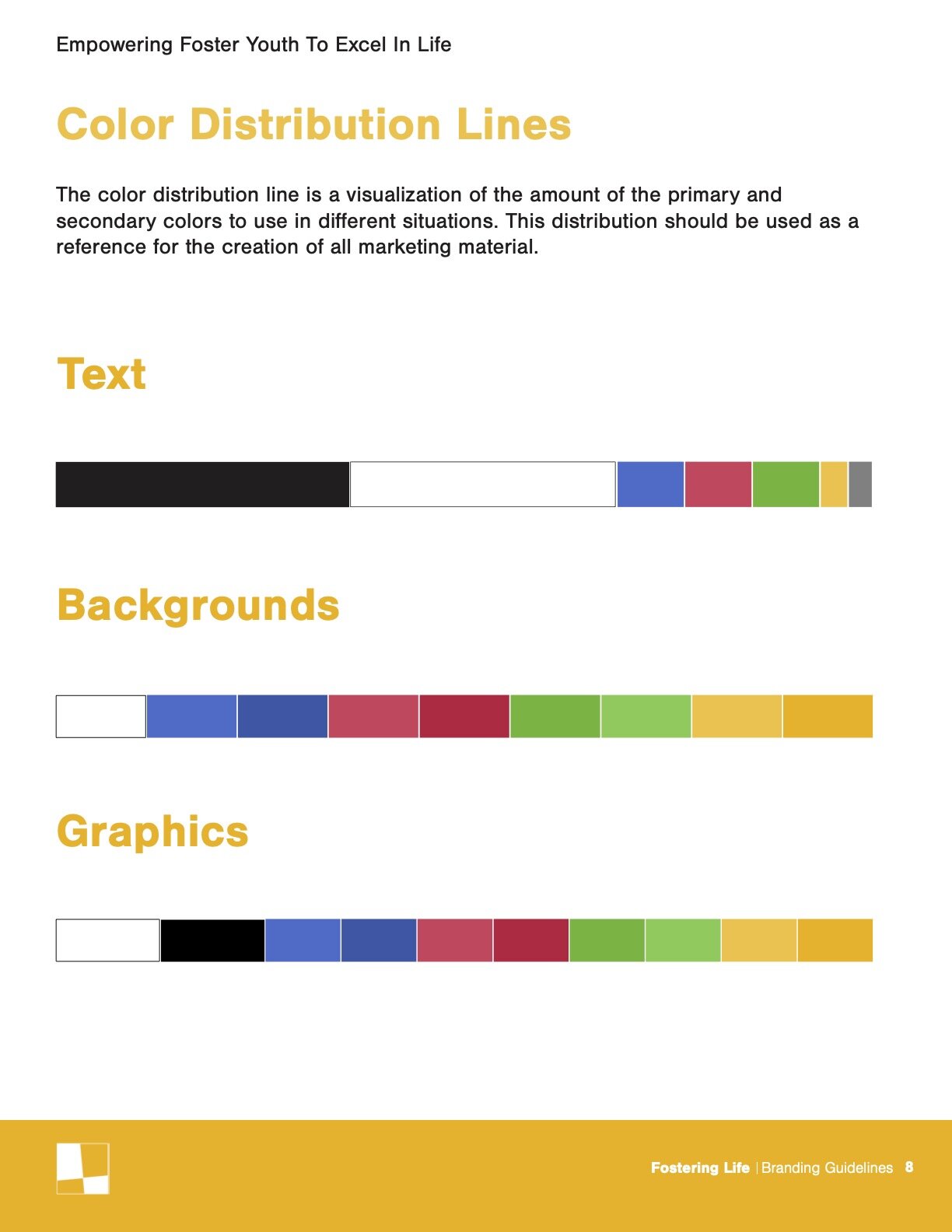
The design of the Fostering Life identity is an expression of the acronym life, 4 colors representing 4 values, connected to form one full rewarding life. The graphic elements selected are rectangles, or better described as building blocks. The organization works to tackle the many issues facing foster youth and not just one. The blocks represent the solutions to those issues. The Photography shows youth being educated, mentored, and enjoying themselves. While the typeface Nimbus was chosen for the brand, as a soft juxtaposition to the environments it will likely be received in, allowing the viewer to let their guard down and engage with the material.


